
Responsive Web Development
It’s essential that your website looks fantastic on any device. However, using pre-made templates can lead to issues. They often lack flexibility and struggle to adjust to different screen sizes, potentially driving your visitors away.
This is where Responsive Web Development shines. Without it, your website might fail to engage users across various devices, hindering your online growth and costing you valuable interactions and conversions.
Here at Bluzz, we excel in advanced Web Development, ensuring your website looks and functions perfectly on PCs, laptops, tablets, and smartphones. We achieve this by crafting websites that seamlessly adapt across all platforms, providing every user with a consistent and delightful experience.
Why Responsive Web Development?
Improved User Experience
Enhanced SEO Performance
Cost-Efficiency
Future Adaptability
What is our approach to
Advanced Web Development?
Custom Solutions
Because we understand that every business is unique, we customize our approach to your website to meet your specific goals and needs.
Priority to Mobile Users
We prioritize mobile users by adopting a mobile-first design touch. Thus, your website offers an optimal experience on smaller screens while maintaining seamlessness on larger devices.
Browser Compatibility
Our professional web development services ensure that your website will function consistently on multiple platforms and in a variety of web browsers.
Optimized Performance
We optimize the speed and functionality of your website so that it loads quickly and allows for seamless user interactions on all devices.
Success Stories
Check out our case studies to discover how our strategic web design and development have transformed businesses.
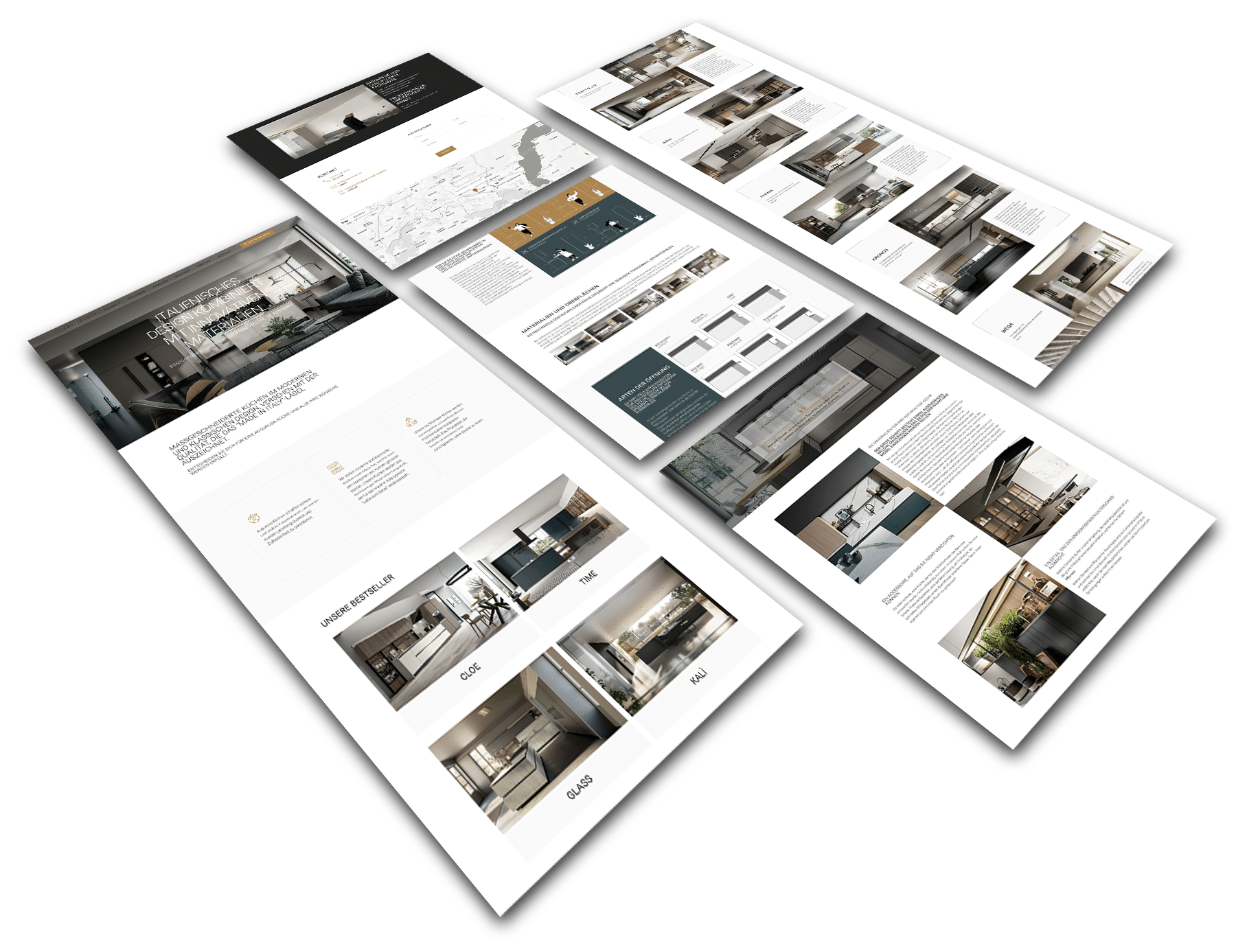
A clean and professional layout, with an emphasis on the image gallery.
A beautiful WordPress website with a simple layout, eye-catching galleries, and easy navigation.
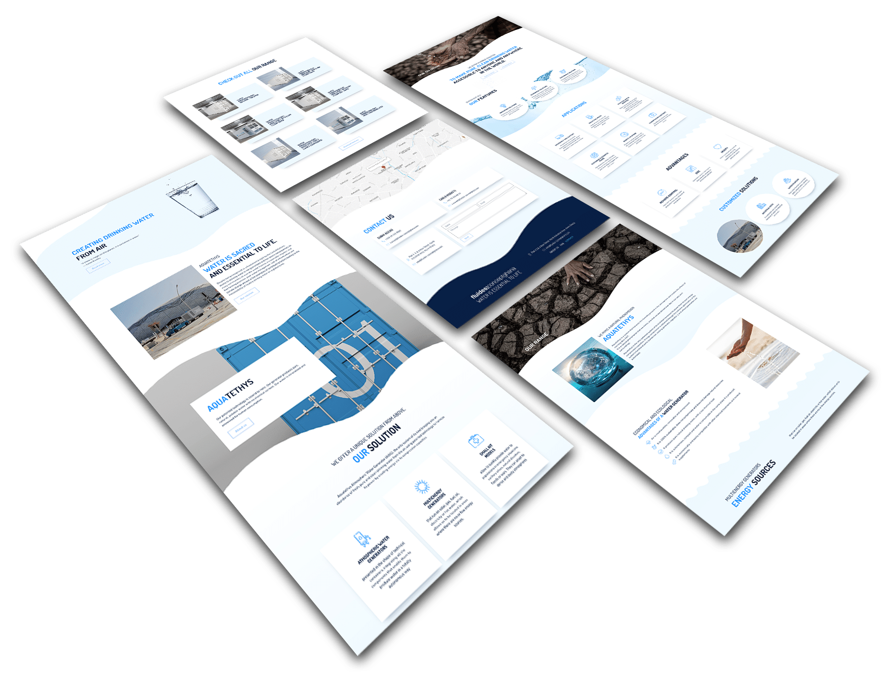
Reflection of access to water to underserved communities through website design.
A dynamic WordPress website with unique graphics, simple navigation, and interesting features.
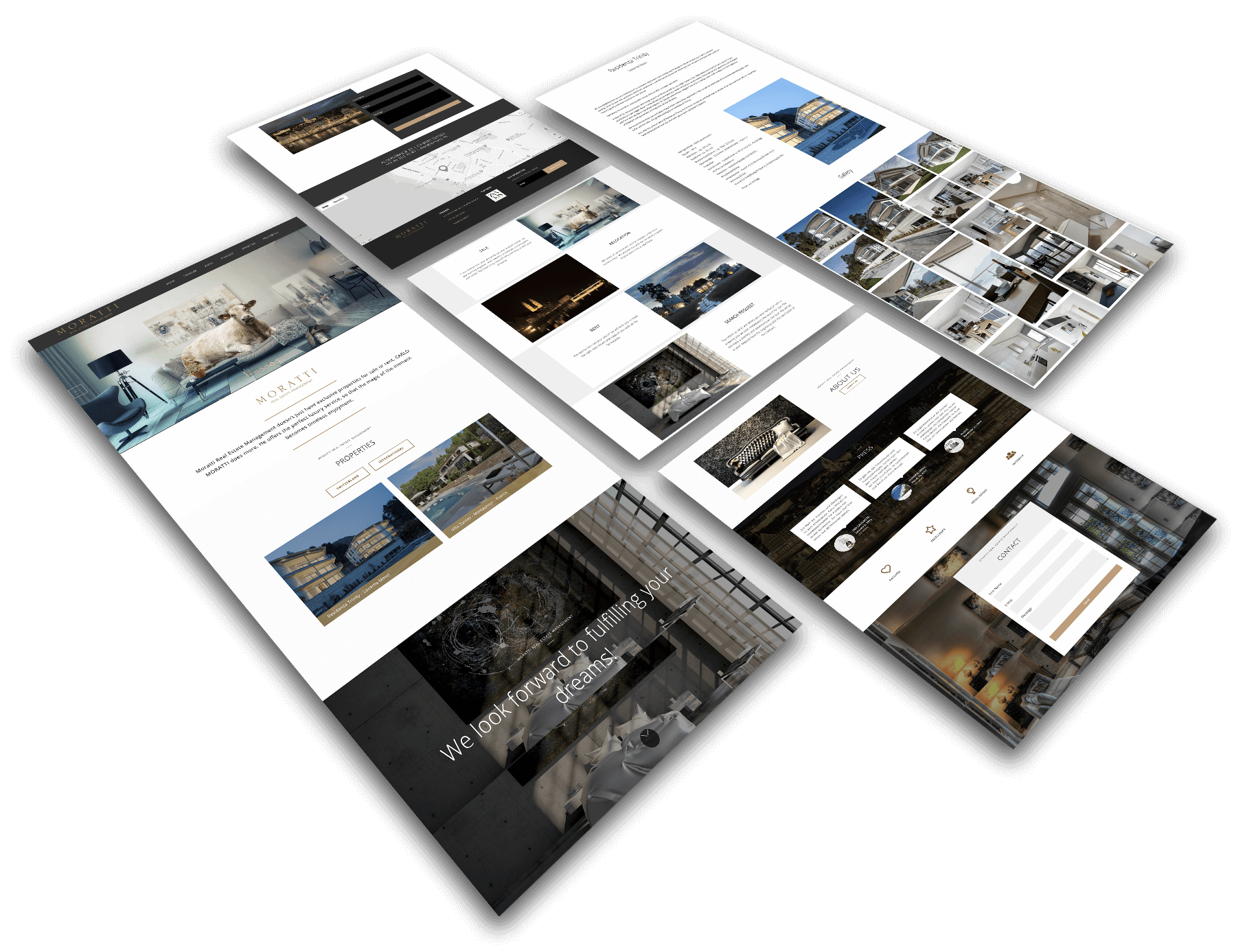
Advanced functionality with a simplistic interface for easy interaction with clients.
An updated WordPress website with a smooth user experience, streamlined functionality, and a modern design.
Ready to stand out with your website on every device?
Engage users across all devices with our Responsive Web Development services. Contact us today to learn more about our services and start building a website that is easier to use and more accessible.
